The setup
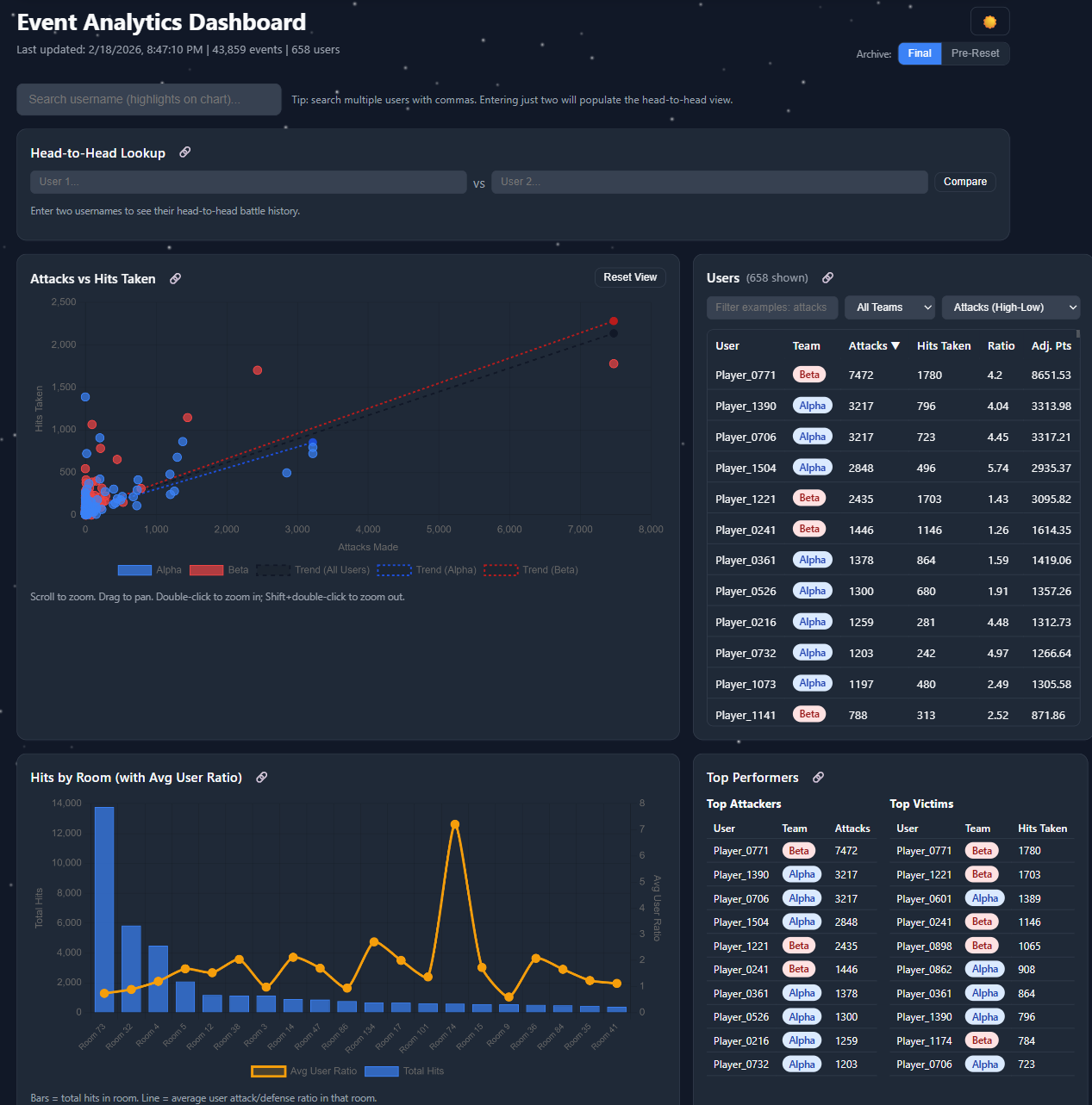
The community I'm part of runs a yearly snowball-fight event — players hit each other with snowballs across in-game rooms, accrue points, and one of two teams wins at the end. The game itself ships almost no analytics. Players couldn't tell which team was leading, where the action was happening, or whether their friends were active. So I built the dashboard the game didn't have.
What it does
- Pulls live data from the game's
/api/gethitsand/api/getsnowteamsendpoints on a schedule - Detects "battles" using a simple heuristic: 30 or more hits in a 120-second window with no gap larger than that — this turned out to be a reliable proxy for "real fight happening right now"
- Surfaces top players, team-vs-team scores, room-level heatmaps (where the action concentrates), and longitudinal trends across the event
- Fires a Discord webhook when a battle starts — pinging the same alert channel my activity bot uses, so the community gets a unified signal
The product decision that mattered
The first version of the dashboard showed every metric I could compute. Hits per minute, attacker/defender ratios, kill streaks, room occupancy — the full firehose. Almost no one used it.
The second version answered exactly two questions: "Should I log in right now?" and "Is my team winning?" Every chart had to justify its presence against one of those. The dashboard got smaller. Daily active users went up.
This is the same lesson I keep relearning at work: a dashboard isn't a metric warehouse, it's a UI for a specific decision. If the chart doesn't change a behavior, it's noise.
The stack
- Frontend: vanilla JS, no framework. Chart.js for visualization, Hammer.js + chartjs-plugin-zoom for touch and pinch zoom. Dark mode because of course.
- Backend: a single Node.js script that fetches, parses, and writes JSON files. SQLite would have been overkill.
- Hosting: GitHub Pages. The dashboard is fully static — the build script commits new data files every few minutes and the site just reads them.
- Telemetry on the telemetry: Google Analytics on the dashboard itself, so I could see which charts people actually used. (See: the lesson above.)
What I'd do differently
The static-data approach was elegant but hit GitHub's commit-rate behavior during peak event hours when I wanted updates every minute. Next version writes to S3 (or Cloudflare R2) and the dashboard polls the JSON directly. Same architecture, less weird coupling to a Git provider.
Why this matters
This was a community project for a niche game, but the playbook — ingest from a flaky API, surface the right two metrics, alert on real signal — is the same playbook for half the product analytics work I've done professionally. Side projects let you make the calls fast and learn from the wrong ones cheaply. Highly recommended.